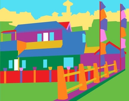
As the Creative Director, I’m preaching about the power of color.
Color is the personification of emotion. When you consider how color relates to branding efforts, it is important to start by asking, “How do I want my customer to feel about my product or service?” This will help guide you to the right colors.
Bored Panda posted an article this week about an Indonesian village called Kampung Pelangi. Kampung Pelangi was known as a slum area where buildings were cobbled together from various materials, the streets were dirty and everything was generally dark and run down.
The local school principle, Slamet Widodo, had a brilliant idea. Widodo was able to secure funding for paint in every color possible to lift the village’s spirits. Community members gathered together and painted every inch of their village. It’s a stunning site. The village has become a tourist stop now, which has boosted both the economy and the villager’s spirits.
The new colors essentially made a brand out of the little town. Kampung Pelangi is now known as “Rainbow Village.” The bright colors used in Rainbow Village are colors from the “active” spectrum on the color wheel. Humans relate the bright, active colors to feelings of joy, happiness, love and energy.
Check out the before and after picture of Rainbow Village on Bored Panda: http://www.boredpanda.com/rainbow-village-kampung-pelangi-indonesia/