An organization’s logo is a crucial part of its brand identification as well as an expression of what the company is all about. Great logos are the ones that we can immediately visualize even if we haven’t seen them in awhile. The Nike Swoosh, NBC’s Peacock, & Mercedes Benz symbol are just a few. Ideally, an organization should develop a fabulous logo and stick with it to achieve the maximum potential of being recognizable, but sometimes changes must be made. Maybe changing times and technology call for a logo’s updating. Sometimes companies evolve beyond the image that their logos express. Other times it is a corporate merger or buyout that leads to a logo’s alteration. No matter what leads to an organization changing its logo, the brand must make sure that it keeps the logo recognizable.
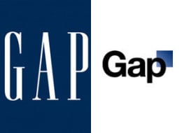
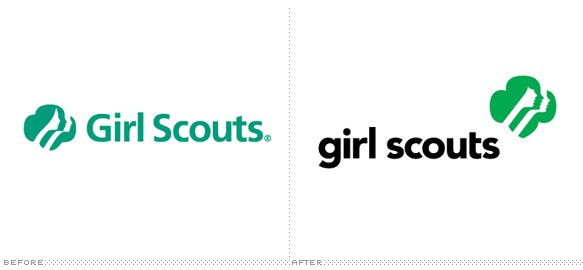
The Gap recently experienced quite a backlash with the introduction of a new logo that wasn’t at all well-received by its fans. In fact, the new logo was quickly scrapped for the classic beloved blue square that it has used for decades. One company that just released a new logo is Starbucks. In an effort to rebrand, the coffee giant offered a new simplified version of its classic siren logo, but without any text or geometric symbols. Another well-known organization is the Girl Scouts, who updated its old logo by utilizing a more modern font and tweaking the symbol of the girl’s profile found in the logo.
The most important thing to remember with logos is that they are clean, simple and express the brand in a succinct way. Don’t let something like a less-than-great logo affect your company’s success.
