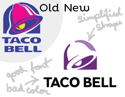
I don’t know the reason for the Taco Bell change, but I do agree the brand refresh was appropriate. In my mind, they made some good decisions and some not so good decisions.
Here’s the good:
The simplification of the bell shape is more modern and iconic. Most of the Taco Bell brand equity is wrapped up in the bell so keeping that element strong was smart.
I do agree with the new font. It’s cleaner and bolder, which makes it easier to read.
Everyone seems to agree that the lizard eye being gone is a good thing. It never bothered me personally, but it does make for a cleaner shape without it.
The bad:
The overall shape of the new design is awkward. The relationship of the icon to the words feels like two separate elements that are trying to live in a same space without any organic connection.
And the ugly:
The solid black on the words “Taco Bell” feels somewhat disconnected from the icon. Color is a very emotional design element that people really remember, so it’s important to choose colors that work well.
Wondering if your brand needs a refresh?
If you answer “yes” to any of these questions, it’s time for revisions.
1. Do you own the rights to your company name? Is there another company with the same or similar name that is causing brand confusion with consumers?
2. Does the brand look dated?
3. Has the company changed significantly? Acquisitions? Mergers?
4. Has there been a change in the brand promise, product or service offerings that makes the current brand no longer relevant?
5. Has your market evolved enough that you need to update your brand to stay current?
6. Has the company acquired multiple other companies that have their own brands?
7. Does the current brand need to be further developed for cross-platform integration?
Fletcher Marketing PR has helped countless clients determine if they need to refresh, rebrand or keep their brand. If you would like some guidance please contact us at [email protected] or call 865.249.8371.