- Stand Out
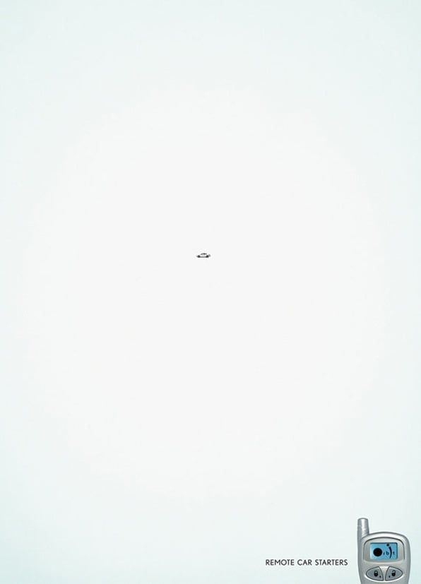
Good design uses color and composition to guide the viewer from point A to point B. Point A is the idea and point B would be the call to action. Large areas of white with a single image or clever copy will set an ad apart from others faster than any other design trick.

- Get to the Point
Companies tend to want to include every detail in an ad. Too many details create a visual haystack that viewers have to pick through to find the needle. The Nissan ad below is a prime example of that. It is a well-designed ad, but there are simply too many elements to look at. While the CTA (call-to-action) is bold, it’s not the quick takeaway it could be if there were fewer pieces of information.

- Be remembered
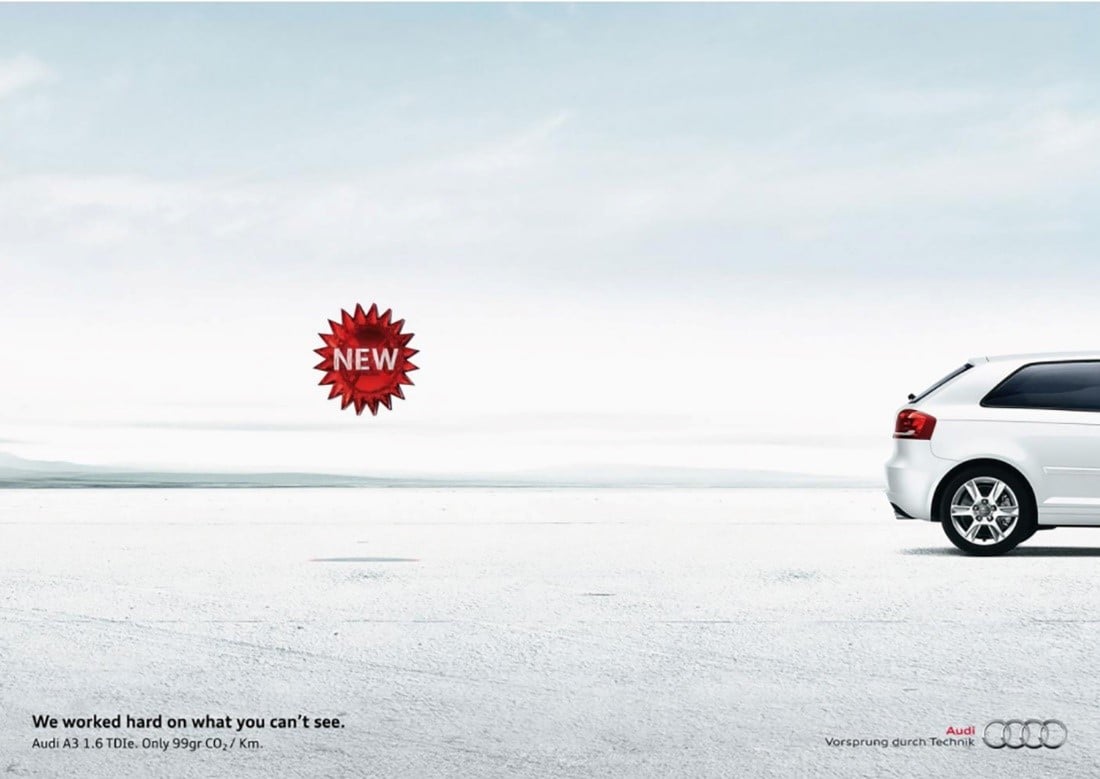
If the viewer walks away with only one piece of information, what is that ONE piece of information? The Audi ad below is super direct. It would be considered a brand awareness ad. It mentions the company name and is intended to become top-of-mind when the viewer thinks about buying a car.

The hardest part of minimalist design is convincing the client that it’s a good idea. The job of an ad is to entice a viewer to engage with a brand. Brochures and websites are the ideal place for a brand to tell the whole story.
For a little history on minimalist design, visit: https://designshack.net/articles/layouts/minimalist-design-is-taking-over-heres-why/